The Lost World (book version) - The making-of
")
For anyone who doesn’t yet know: I recently bound a Snarry fanfic (The Lost World by
Now, a lot of thought and experimentation went into this bookbinding project, so as a result, this post will be quite long, and at times even technical. Feel free to take your time reading it, or even skip some parts altogether. However, I do recommend you read ‘general info’, since that’s where I explain a few bookbinding terms I’ll be using later on. Also note that this is not meant to be a tutorial. It’s mostly a break-down of my proces, so that you can see exactly what one has to take into consideration for a project like this. If anything is unclear or you’d simply like to know more about a certain topic, don’t hesitate to ask. Otherwise, hope you enjoy!
General info

The binding method I used for this book is called ‘case binding’, which is very commonly used for machine-made books. If you own any modern hardbacks, I’m sure that most, if not all of them, are casebound. And that’s not a bad thing, because it’s a reasonably sturdy binding method. It’s not suitable for big books, however, since it’s simply not strong enough to support a heavy text block. Big casebound books, like encyclopedias, will usually fall apart or warp out of shape over time. I don’t think that will be a problem with The Lost World though.
One characteristic of a case binding is that the cover and the text block are made separately, and only glued together at the very last. This is pretty easy to do by machine. By hand, unfortunately, not so much. But that’s a story for another time.
For those of you who don’t know what a text block is; it’s technically a book without a cover. If you had a book in your hands and you ripped the cover off, you’d be left with just the sewn-together pages, right? Well, that’s a text block. And if you glued the cover back on, you’d have made a casebound book. Simple as that.
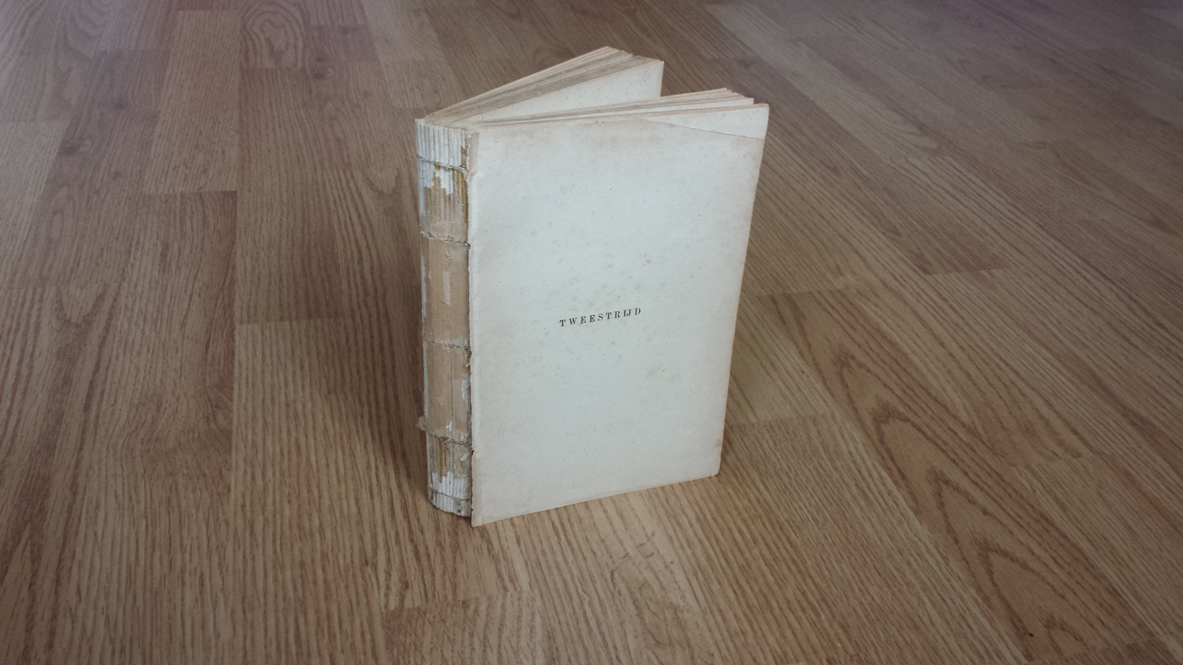
This is a text block
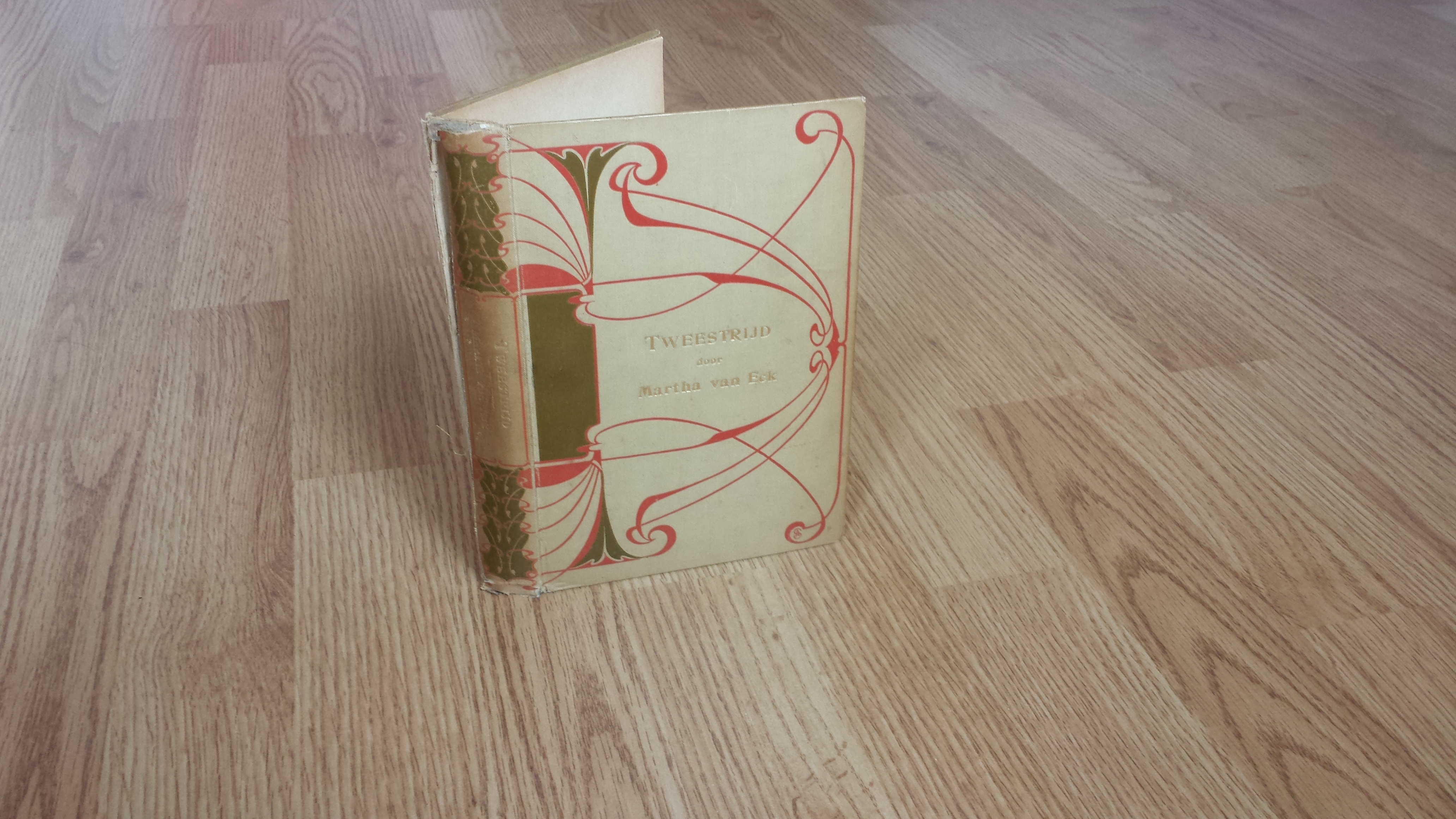
This is a cover

Glue the text block in the cover and you have a casebound book!
My binding of The Lost World is A5 sized and contains 40 pages. The boards are made out of 1,5mm thick cardboard, which is covered with waxed plant paper and black linen to make the cover. The text block has just three signatures and is made with two types of paper; a pinkish beige one for the text and a sturdy black one for the endpapers. These signatures are sewn together with simple white cotton thread. Contrary to popular belief, the text block is also where I used the dried grass, but I’ll tell you all about that further down.
Initial idea & Inspiration
The idea of combining bookbinding with fandom wasn’t a new one to me - I had already made a fanfic-inspired notebook for a friend a while back. I had also already played with the idea to bind an fic into a book, but didn’t have any serious plans to do it until the most recent Snowflake Challenge. One of the challenges was to create a fanwork and that’s when I knew I wanted to make a fanbook. But for which fic?
Like my hero Henry Morris, from the wonderful Bird & Bull Press, my choice of text was first and foremost inspired by paper. I had this gorgeous paper in my stash that I really wanted to use. I also had this other material in the back of my head that I wanted to experiment with. Both materials had plants in them, and when I read the summary of The Lost World, which mentions a garden and a forest, everything just fell into place. Later, when I read the fic and saw how well-written and wonderfully descriptive it was, I realised I’d made a really good choice. However, it was my materials that led me to it initially.
Now I had a text to bind, it was time to work on a book design. For that, I had to do some research. I read the fic, the comments and any recs for it I could find, and I also took a look at artworks that reminded me of the story. One that really inspired me was this wonderful fanart of the fic, made by cabepfir, that I found in the comments on LiveJournal. It was that drawing that set me on the track of putting Harry and/ or Snape on the book cover. Another inspiration that I should mention is a song that really reminded me of the story, namely The Willow Maid by Erutan. The story in that song is in many ways quite similar to Perverse Idyll’s fic, so I listened to it a lot. The fun cut-out animation gave me ideas for the mood and the fairytale-like quality that I wanted to depict. Both the chorus and the very last line of the song are perfect for the fic, to the point that was humming them almost non-stop for months. If anyone asked me what sound I associate with this project the most, I’d send them a link to this song as my response.
Cover design
I knew from the start that I wanted to include a lot of texture in the book in order to reflect the sensory nature of the story. Luckily, the materials I had picked were very textured already, so I got that down. Next thing to do was to start drawing. My first cover design was based on all the touching that’s going on in the fic and very much inspired by cabepfir’s fanart. The idea was reasonably complicated, however, so I decided to make a few quick little models to see how it would work in 3D.

A few ideas
This is how the book would have looked when closed
The idea was to have Harry on the front cover and Snape on the back. Their arms would stick out of the cover and reach around the fore edge of the book to touch each other. Snape’s hand would cover Harry’s eyes, while Harry’s would go over Snape’s waist. Their arms would also serve as clasps and I had already worked out a structure with magnets and iron wire to make that work. I was very excited about this design. If I had gone for it, it would have meant that the reader would have had to separate Harry and Snape from each other in order to read the fic, and thereby seal their fate. I loved the idea that the reader would be a part of the story just by the act of opening the book. However, during all my experiments to try to figure this structure out, there was this nagging feeling in my gut that said that this design wasn’t it and I eventually realised why: it was missing the magic. Magic is such an important part of the fic that I felt it had to be part of the design in some way. If it was missing, it meant I had some more brainstorming to do.
When I was trying to come up with something else, my gaze fell on my paper stash, especially on this gorgeous waxed paper that reminded me of parchment. It had plants in it, so it could work with the fic. The only problem was that it was transparent and would therefore be difficult to use. But assuming that I could solve that… The plants did look a little like branches and if I were to add Harry and/ or Snape to it in some way, it would look like they were in a forest and… Got it! And so my second design was born. This one did have the magic I was looking for and so it became a book.
Typesetting & Page-design
This part of the process was completely new to me, so I didn’t know how much work it would be. I knew that online stories have a lot of white space between the lines, which printed books usually do not, so I’d have to remove most of it from The Lost World. I also knew I’d have to play around with margins and fonts, but that was were my knowledge of typesetting ended. So I took to the internet.
It thought this part would be boring, but it was very fascinating actually. I found a couple of very helpful typesetting blogs that I got lost in for hours. They taught me the rules of creating good looking indentations and italics, the importance of designing the text in spreads rather than on single pages, and the science behind the width of margins. I kept running to my bookcase with a ruler to check how all of this was done in other books. I’m glad I have a lot of books, because it was very helpful to be able to compare modern books to antique ones, children’s books to adult literature, cheap, mass market books to more expensive collector’s editions. It made me understand how even small details can shape the perception of a book, which helped me in giving the page layout the feel I wanted the reader to have.
I transferred everything I learned to my project, and it worked! The text looked better and better with each editing round and I had a lot of fun working on it. I made the margins reasonably wide, to give the book a more luxurious feel, and I picked Garamond as the font. The HP books are printed in Garamond as well and I liked having this subtle nod to canon in the typography. I also really enjoyed working on that first page with the author’s information. It was interesting to try to combine fanfic conventions, like the copyright statement, with those of traditional publishing, like listing the author’s other publications, and I’m very pleased with the end result!
First attempt at typesetting, when I didn't have a clue what I was doing yet. The indendations are too big, the text is only aligned on one side, the top margins are too wide and the bottom ones too small, and I thought that page numbers were unnecessary for such a short text. Not saying that the final version is perfect, but at least it looks much better!
The only problem was that I didn’t have access to professional design programmes and had to do all of it in Microsoft Word instead. Word obviously lacks some functions compared to those programmes, so my work has a few flaws that were impossible to fix. I’m not beating myself up over those, though.
Printing; a story of frustration
The printing was the most frustrating part because it took forever. I don’t have a printer, and the only people I knew who had one were my parents. They live in another city though, and I don’t go there very often, so every time something went wrong I had to wait a few weeks before I could try again. And believe me, things did go wrong.
The respectable pile of unsuccesful printing attempts.
I started with a couple of test prints on cheap paper just to see how the fic would look. I corrected any typesetting mistakes I found and tried again and again until I was happy. That’s when I moved on to the paper that made me want to do this project in the first place. It’s this beautiful, slightly off-white paper with a lovely texture and plants in it. I printed the first page and when I had it in my hands, I fell in love. The text looked absolutely fantastic on that paper. It was so amazing to see my vision come to life! I couldn’t wait to see the what the rest of the fic would look like. I hit ‘print’ on the second page and stared at the printer, waiting to see a new gorgeous page come out, but it never happened. The paper got sucked in, the printer made an odd, squeaking sound, and that was it.
My father and I took a look and as it turned out, the sheet was completely stuck in the printer. It broke my heart to see it. We managed to get it out, somehow without tearing it, and that was the end of that printing session. I had no idea why this had happened, so it was better to put the printing on hold until I had figured it out. I took the sheet home and flattened it. I thought the uneven edges of the paper had caused the problem, so I took the time to even them out. I went back to the printer a few weeks later to try again, but the paper got stuck again, and even tore this time, so I had to admit defeat.

The succesful first page. This is how I had wanted the whole fic to look. Doesn't it look great?

And the massively failed second page. Seeing this still hurts...
In all honesty, the loss of the paper, and therefore my vision for the book, hit me quite hard. I had to take a break and even considered giving up altogether. But after two weeks I realised I was still excited enough about the project to want to finish it, so I took a deep breath and went for it. I had some paper hunting to do.
The hunt didn’t take long because I secretly already knew what I wanted. There’s this beautiful paper, called ‘Ingres mould-made’, that I had used a few times before and always loved to work with. It’s made to closely resemble paper from the 17th century, which I felt would work with the text nicely. It comes in multiple colours and after some internal debate, I went for the pinkish beige one. I was afraid that it would scream ‘Valentine’s day!’, which isn’t really what The Lost World is about, but it just went so well with the green that I couldn’t help myself, and I don’t regret the choice at all. The paper comes in big sheets, so I had to cut it into smaller pieces and then I was ready to print again. This time, the pages glided through the printer smoothly, as I knew they would, and I finally, finally, had my printed fic.
Whew.
Making the text block
Making the text block was straightforward for the most part. I folded the sheets in half to create signatures, marked and pricked the holes for the needle and sewed the signatures together. Then I glued the black endpapers on, cut all the edges straight and glued on the endbands. Finally, I glued bookbinder’s gauze onto the spine to strengthen it. That’s when I thought it was done. However, my teacher took one look at my endbands and said that I could do better than using pre-made ones, and she was right.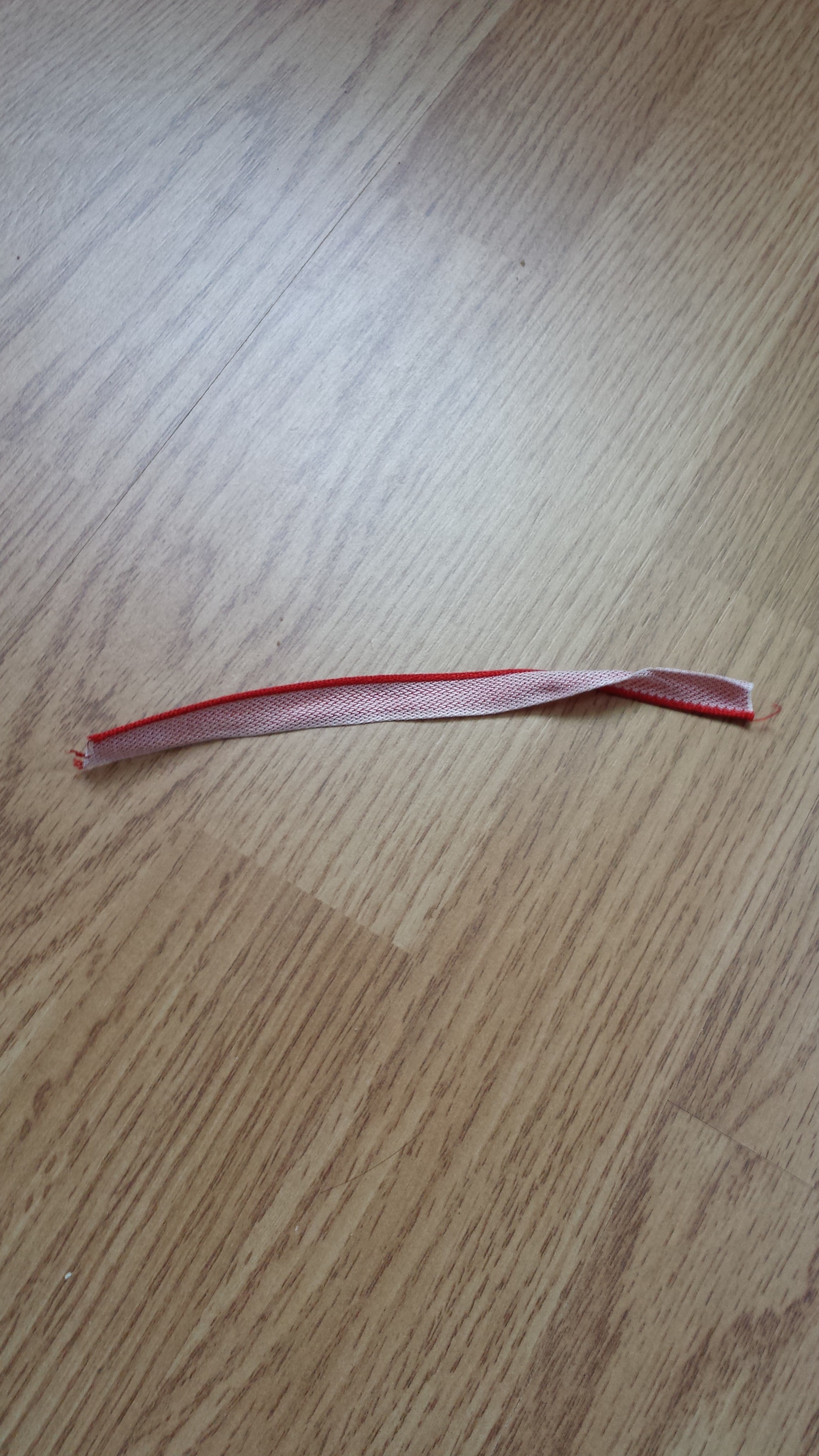
An example of pre-made endbands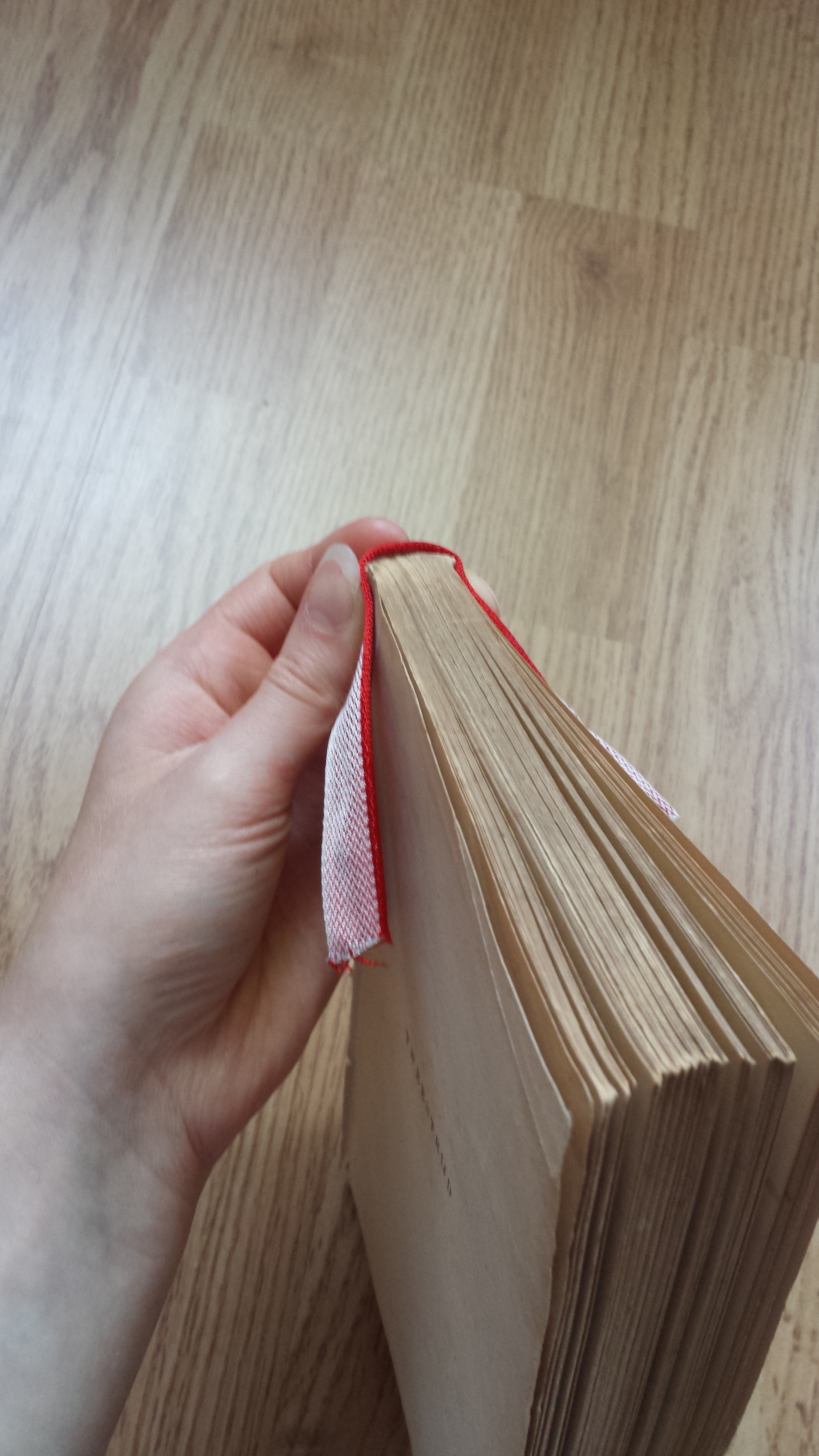
And this is how they are glued onto the spine of the text block. Though the example on the photo will obviously need to be cut to size first.
It was true that it would be a shame to work so hard on this book, and spend so much time designing it and making it unique, only to slap on silly endbands that didn’t quite work with the rest. I still didn’t want to sew them, but when I was musing about what I could do, slowly and surely a new idea formed. I had already dried some grass a few weeks earlier in case I’d need it for the cover, but what if I tried to use it for the endbands as well? I spent some time experimenting and eventually settled on the idea to wrap a blade of grass around a piece of string. I have to say, trying to wrap one flexible thing around another is surprisingly difficult. It definitely took a little bit of practice. I had to pull hard on the grass to get it to wind evenly around the string, but if I pulled too hard, it would break and I’d have to try again. But I did get it right eventually. When I had my two endbands, I glued them onto the text block. To my big surprise, they didn’t fall off and even looked good. Yay!

Don't mind me, I'm just a grass connoisseur trying to select the perfect blades for my endbands
The final endbands! They still needed to be cut to size at this point, which I did immediately after taking this photo.
I’m really pleased with how they turned out. They work well with the rest of the design and make the book a lot more personal and unique. It also feels great to have been able to put a creative spin on such a traditional aspect of bookbinding. My endbands are incredibly subtle though and nobody notices them without me pointing them out, which I think is quite funny.
And with the endbands glued on, the text block was completely done!
The cover
When the text block was finished and I knew it’s exact measurements, I could finally start on the cover. I cut the boards to the right size and glued them together. Then I cut the black linen to the size I wanted and glued it to the spine.
Now came the most exciting part: working with the waxed plant paper. I had to prepare it first, however. Remember that I mentioned earlier that it was transparent? Well, the moment had come to deal with that. Considering that the paper was also too thin for my needs, the most obvious solution was to line it. After some experimentation, it was clear that I needed something thin, light-coloured and sturdy to do so. With those requirements in mind, I realised there was only one real option here: Japanese paper. Japanese paper is fantastic. It’s made from the Mulberry tree and is beautiful and high quality. It isn’t very suitable for bookbinding, but it’s an absolute staple in book and paper conservation, because it’s thin, strong, acid-free and easy to dye, and therefore perfect for paper repairs. Anyway, before I start singing its praises here, let me just say it had the perfect qualities for my needs.
I went out and bought the Japanese paper that I thought would be the most suitable for my project. I glued it to the plant paper and waited a week for it to dry. Then I cut the lined sheets to size and glued one of them on the back cover. The sheet that would go on the front was left alone for now. I had plans for it.
On the top: the cover with the black linen on the spine. On the botom: the lined plant paper
Anyone who has seen the book will know that it has a silhouette of Snape on the front. Well, this was the part of the process when I worked on that. I drew a multitude of Snapes and picked my favourite. Then I took a sheet of sturdy paper in the exact size of the cover and drew the silhouette on it, so that I’d have it in the right proportions. I cut the silhouette out carefully so I could use the paper as a template. Then I positioned it on the waxed plant paper, taped it down, took a knife and simply started cutting out the white space in between the plants until all the holes together were Snape-shaped.

Before cutting: positioning the template on the paper
I’ve seen a lot of people musing on my technique for this in the comments and I’m impressed by how imaginative some of those ideas were. However, in reality, I only used a knife. I didn’t dye fabric, I didn’t play around with modelling paste and I didn’t glue grass on the paper (though I did experiment with the latter, but it didn’t look good). No, I just used a knife. I like keeping things simple.

And a solid 8 hours of cutting later, stained-glass-window!Snape had finally emerged
When Snape was finally cut out of the paper, I cut him out a second time in black linen and glued that behind the silhouette in the paper very carefully. I didn’t want any cardboard to accidentally peek through. I also didn’t want any spilled glue on the linen, since that’s almost impossible to get out. This was a challenge, because the glue dries very quickly. Somehow I was successful, however, and I could congratulate myself on a job well done.

Black-linen!Snape and Stained-glass-window!Snape. Now sitting calmly next to each other, but soon glued together and made into one silhouette
I glued the Snape-silhouetted paper onto the front cover, pulled it tightly around the edges of the cardboard and made sure to get the corners absolutely perfect. Then I put the finished cover under a pile of heavy books and stayed away from it for as long as I could.

The finished cover! Feel free to admire my even edges and neat corners. The perfectionist in me is very pleased with them.
Title & Wrap-up
I knew from the start that I wanted the title on the cover. To make that happen, I used a technique called ‘hot foil stamping’, which is similar to traditional printing, since you need metal type and a press for it. The bookbinding studio I go to has drawers and drawers full of metal types, so the first challenge is always to pick a font and size. I chose Garamond again, because it’s just a beautiful font.

Metal type! I forgot to take a photo of them in my bookbinding studio, but I found this one on my phone that I took at Plantin-Moretus, the book and printing museum in Antwerp (highly recommended!).
When I had all the letters I needed, I packed them tightly in a chase and put them in the press so they could heat up. When it was ready, I made a test print on paper to see how wide it would be and where exactly it would print. And thank god for test prints, because when I made mine, I discovered I had accidentally written ‘Worlb’ instead of ‘World’. Oops.

The title in the chase. Yes, the title (and all the letters themselves) are in mirror image, which is why it's so easy to accidentally switch your b's and d's.
When you have the font and size figured out, you still have to decide whether you want to print your text in colour or not. The studio also has a few drawers full of foil in all the colours of the rainbow, so picking one can be a challenge. In my case, I knew I wanted the title to be blind, because I didn’t want it to draw more attention than Snape. However, blind stamping turned out to be too subtle, so I used a transparent foil instead, which makes the title shine when the light hits it. Still very subtle, but it adds a little bit of a surprise effect that is rather nice.
My stamping tests from a previous project, where I did use coloured foil.
With all of those important choices made, I had to decide exactly where I wanted the title to be on the cover. Did I want it in the middle, or closer to the top? I eventually went for the second option, because I felt it would work better with the asymmetry of the rest of the book. Then I took the book to the press and stamped the title on. This is always scary, but the title ended up straight and in the correct position, so yay, success!

The finished cover with title!
With the title done, all there was left to do was to glue the text block into the cover. This requires some patience and precision. Unfortunately, my boards weren’t entirely straight, which meant there was no way I could glue the text block in straight either. I glued it as straight as I could have though, and that still counts as a success to me. Once I was done gluing, I put the book in the book press and then the actual handwork for this project was finished. I spent the rest of the afternoon finishing the slipcase I talked about in my previous post, and went home at the end of the day feeling incredibly accomplished!
Photography & Aftercare
The book itself might have been finished by this point, but the project as a whole was not. As long as the book was still wet, there was a chance of the boards warping. The best thing to do to prevent this is to leave the book in the press for as long as possible, preferably a few weeks. However, I still had to take photos of it, so I had to take it out of the press after just a few days if I wanted to make my (already extended) deadline. I was very unhappy with this, but I didn’t have much choice. The photos were my actual Thon entry, they were what everyone would see, so I had to take them, and I had to take my time with them to make them as good as I was able to.
So I cleared my table and figured out how I wanted to do this. I wanted one ‘fashion’ shot to draw the attention, and then a couple simpler shots showing different sides of the book. I wanted the fashion photo to look a little like a 17th century still life painting, because I thought that would be fun. The other photos would just have a white background, so that nothing would distract the viewer from studying my work.
For the fashion photo, I took a couple of my oldest leather-bound books, collected a few other objects that reminded me of the fic, and arranged them in an interesting way. Then it was time to take the pictures. This took a while, because I was so afraid of the book cover warping that I put it back in the press after every few photos. This was much more stressful than it should have been, so if I ever do this again, I will try to finish the book a few weeks before the deadline.
When the photos were finally done and the book was safely back in the press, I sent them to ![]() acid , who had promised to help me edit them. He wanted to order them in such a way that anyone seeing them would feel as if they were making a journey through the book, which I thought was a fantastic idea. Acid did such a great job! I’m very happy with the results. When I had the photos back, I tried to write a summary (honestly, how do you summarise a craft project?), sent everything off to the mods and then my Thon entry as a whole was finished.
acid , who had promised to help me edit them. He wanted to order them in such a way that anyone seeing them would feel as if they were making a journey through the book, which I thought was a fantastic idea. Acid did such a great job! I’m very happy with the results. When I had the photos back, I tried to write a summary (honestly, how do you summarise a craft project?), sent everything off to the mods and then my Thon entry as a whole was finished.
And now you’re probably wondering: did I manage to prevent warping? Unfortunately, no. But not for lack of trying. I put the book back in the press after taking the photos and stayed away for weeks until it was completely dry, but it still warped a little when I took it out. And now that the book is dry, there isn’t anything I can do to fix it.
There are many reasons why warping can occur, not just having to take it out of the press too soon. I might have been too liberal with the glue. Or perhaps the endpapers are much stronger than the cover material, and therefore pull on the cardboard much harder. Perhaps the cardboard I used was simply too thin. Anything is possible. However, I noticed that the front cover is much more warped than the back cover, and what do I have on the front that I don’t on the back? Exactly: Snape. So the warping is probably Snape’s fault. I suppose he’s just trying to escape and, you know, I don’t think I can be angry with him for that.
A few final words
With this post finished, this whole project has finally ended. It has been a journey that I won't soon forget. I ran into many problems and difficulties during it, most of them not mentioned here. But I'm glad I pushed through and finished the book, because it was a very valuable and enjoyable experience.
Am I proud of the final result? I don't know. I made a ton of mistakes in the binding. I made sure not to photograph them, but they are there and anyone seeing the book in RL will notice them too. However, I also know I put my heart and soul into this book. I gave it all I had, so all my mistakes are due to either lack of skill or lack of knowledge - not laziness. I now know exactly what I need to work on to become a better bookbinder and I wouldn't have known that without this project. I suppose I'm proud of that.
Would I do something like this again? I'm quite sure I will, yes! It's rather addicting. I even already have a few designs finished for other fics. It's surprisingly easy to do now that I've already done it once. However, there are a few things I need to figure out before I bind another fanfic. I ran into a few personal problems during the binding process that I'd prefer never to run into again, so I need to find a solution for those first.
And with all of that said, this project is fully done. Thank you so much to everyone who left me such enthusiastic and positive comments! They really meant a lot. If I haven't replied to you yet, don't worry, I will soon. This monster post just needed to be finished first. Speaking of monster posts, I want to thank my good friend